Designing is not easy and is not just like throwing drawings into a software. This particular task took some time and perhaps the value at the end is minimum to the company compared with my other regular documentation work. But boy! I enjoy it.
Learn by doing
As you might know, I studied Computer Engineer (the career of the future in 1996). But I have always been such a fan of design that I keep coming back to it somehow.
I love to learn, it is part of my motivation. I’m trying to get back into design but really making sure that I have all the basics cover. That’s why I started with this design course at Platzi: Curso de Introducción al Diseño https://platzi.com/clases/fundamentos-diseno/
It is really easy to consume the content since my native language is Spanish. I was amazed how easy is to learn in your own language, I have completely forgotten that. It feels like riding a bike and by doing so you make friends again with the kids of the neighborhood.

Projects
In this design course, we have some projects, and I have been working on an album cover. The album cover I decided to redesign is from Daniela Spalla, the single “Costa Rica“.
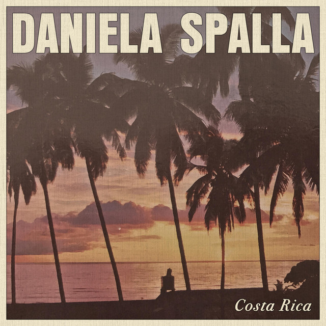
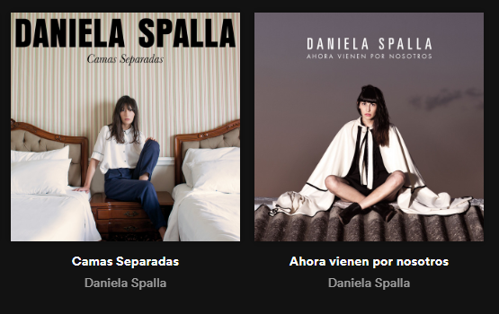
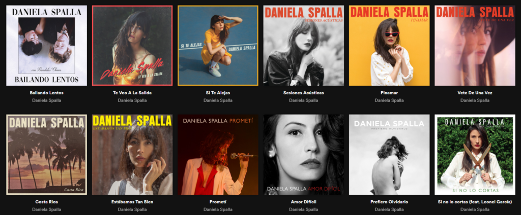
Here are some of her album covers I used for inspiration (Screenshots taken from Spotify).
Investigate
First I took some time to investigate the artist, I listen to her music, read about her career. That preview step is quite important. This particular single “Costa Rica” is all about a relationship that is coming to an end.
Based on this investigation I defined the main elements I wanted to incorporate into the design of the album:
- Nostalgic look.
- Center aligned text.
- Flower bouquet.
- Simple wedding dress.
- Beach background, high contrast blue.
- Wedding arch (decoration).
- Palm to the left side, a bird or an airplane into the right side (thank you Alex for that idea).
- Typography: I plan to use the same she has been using for most of her album covers like in “Camas Sepradas”.
- Color palette: although I’m really looking forward to a high contrast blue in the background (Costa Rican sky in the summer is blue with no clouds), I’ll love to play with color pallets used in the 70’s rock ballads albums.
Sketches
Getting into this point has taken at least 2 hours. I usually get to study early in the morning for at least 30 minutes; so, I have been using that time to work with this project.
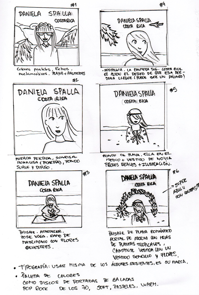
For example, this one below is the one I’ll be using. It’s a “merge” of all the ideas so far. She has a nostalgic look, reminding the good times of that relationship. The palm to the side contrast with the plain or bird to the right, it means that they are getting apart. The improvised wedding is due to a part of the lyric that it really resonates and sticks out that talks about that couple getting married in Costa Rica for a while, pretending that their life is perfect.
Casémonos en Costa Rica
Songwriters: Maria Daniela Spalla
Por un rato, de mentira
Y finjamos que es perfecta nuestra vida
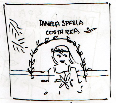
After this blog post, I’ll keep working on the digital version of this design. But I already have a blocker. I don’t know how to use Photoshop, I used Gimp and Inkscape in the past. Let’s see how it goes.
Check the final result in Album cover exercise
And this is the career path: https://platzi.com/interfaces-ui/


